OCTO:Open Core for Technology Orchestration/TDOMS/Analytics
Analytics Introduction
The Octo Analytics plugin for TD/OMS provides a customizable dashboard for TD/OMS. The analytics are SQL-based and allow for KPI analysis.
You can add graphs to the dashboard by inserting SQL statements in the OMDSH file.
Setup the Analytics Provider
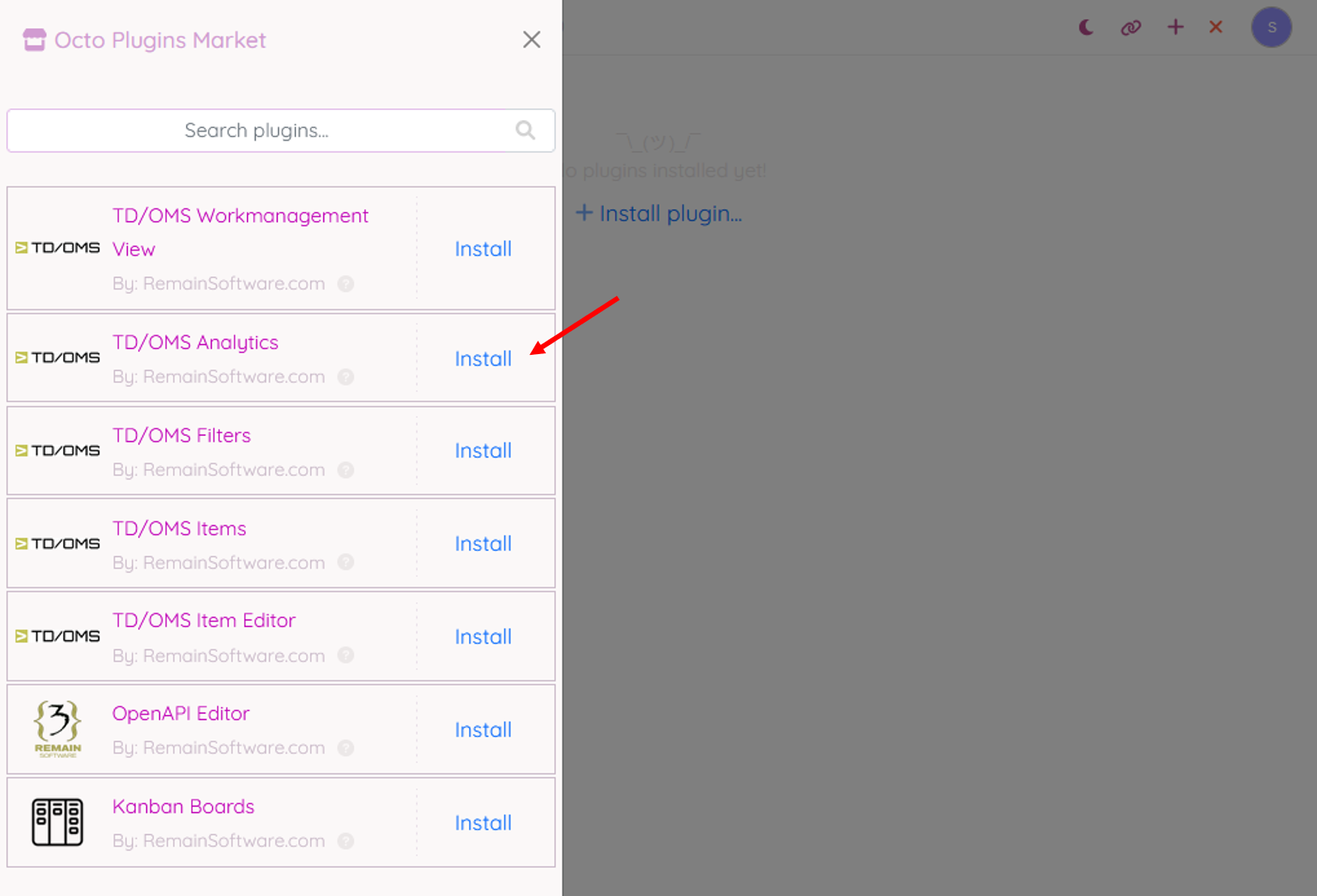
The Analytics plugin can be installed in a perspective.
Analytics
The Analytics Plugin provides a visual dashboard that helps users monitor key development and task-related metrics. It displays data in the form of interactive bar charts for better visibility of trends, issues, and workload distribution across teams and users.
1. Dropdown Menu Description
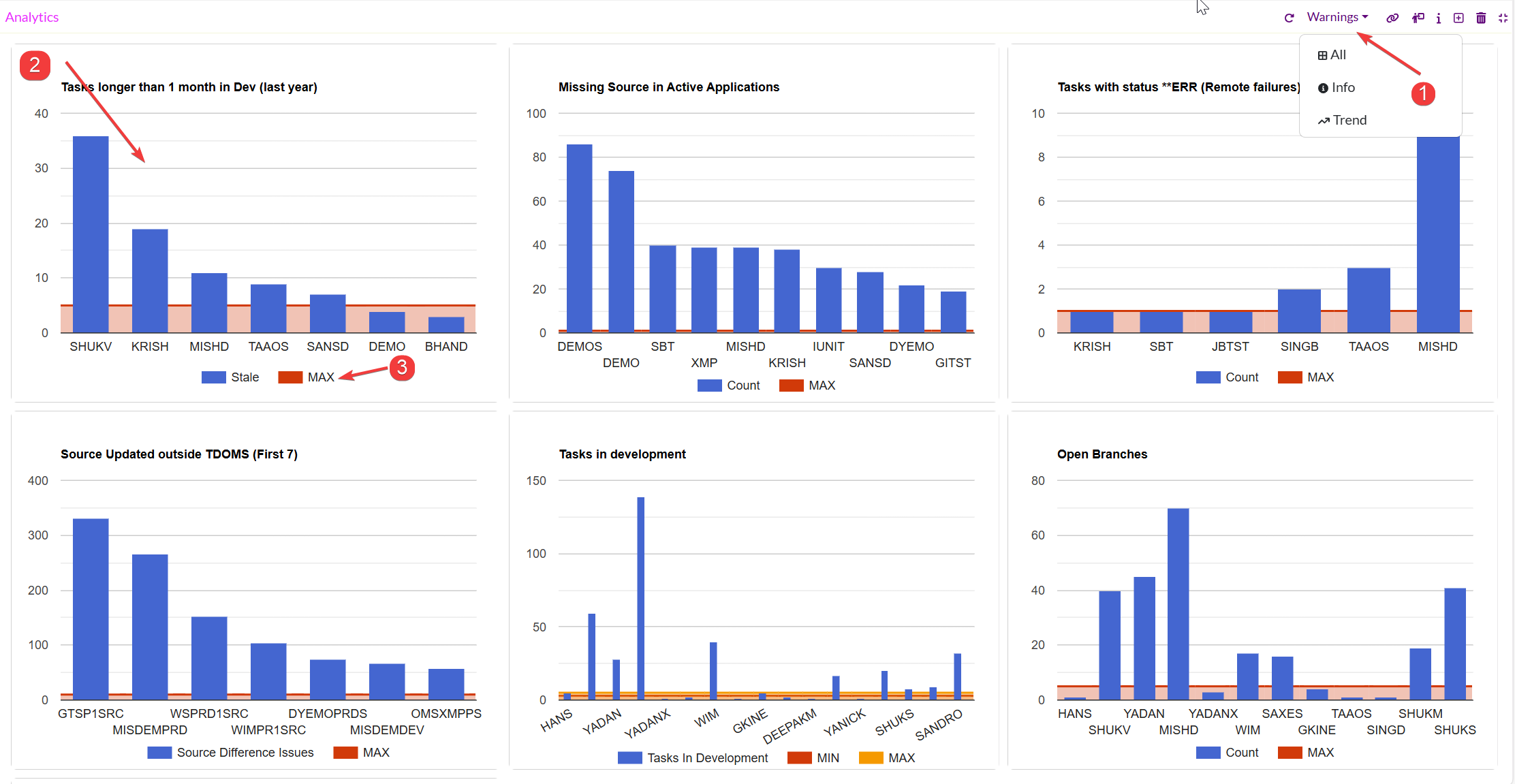
Located at the top-right corner of the plugin, the dropdown menu provides options to filter or adjust the type of data being displayed:
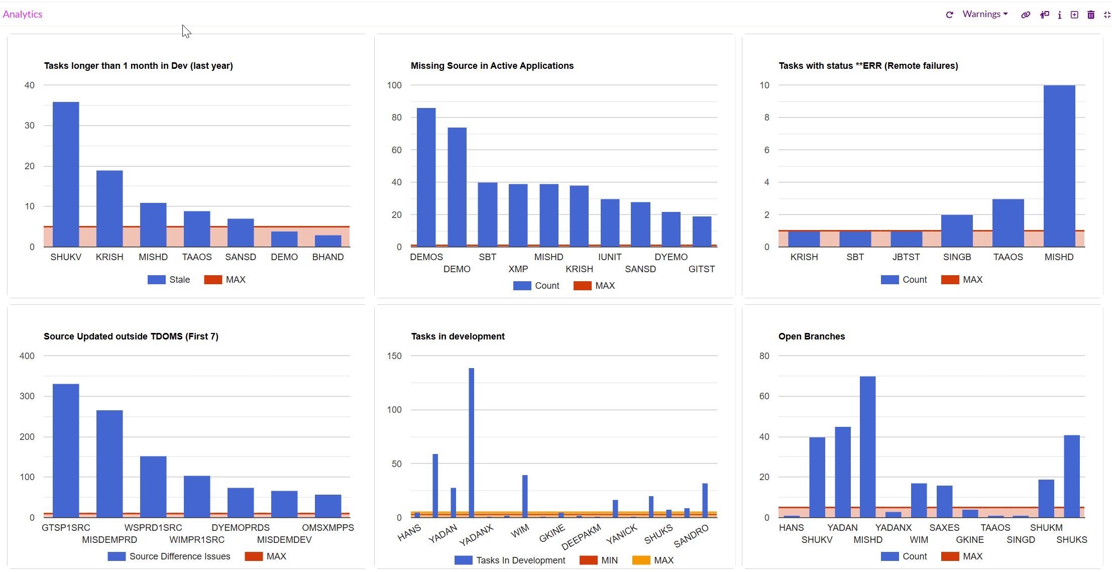
- Warnings- Displays warning-related data and highlights potential risks or anomalies (e.g., stale tasks, missing sources, or errors) that need user attention.
- All- Displays the complete set of available analytics data across all charts.
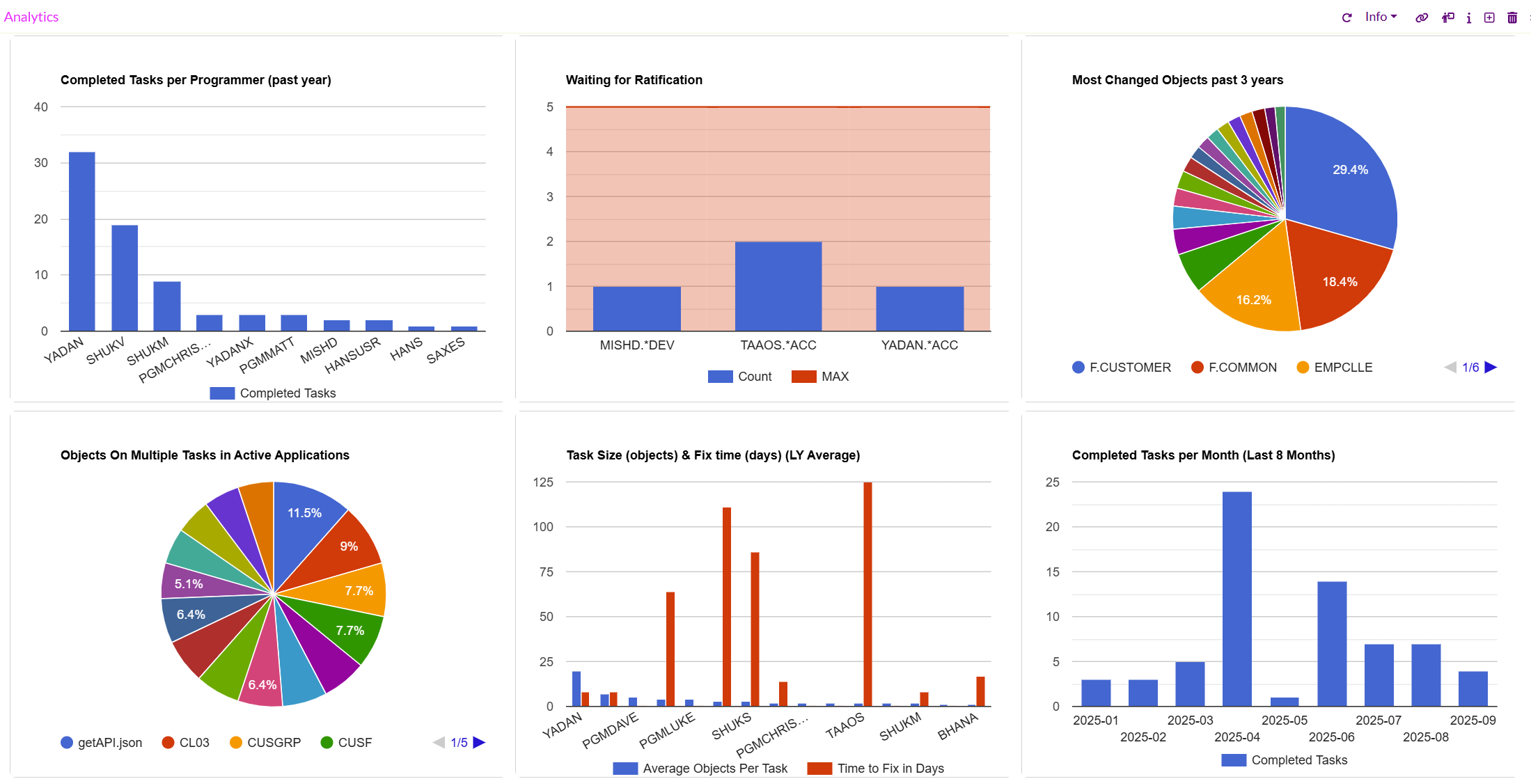
- Info- Shows only essential informational data, focusing on summaries or counts without trends.
- Trend- Focuses on displaying trend-oriented analytics, highlighting variations and changes over time.
This dropdown enables users to switch between detailed, summary, and trend-based views for better insights depending on their need.
2. The plugin is divided into multiple chart panels, each focusing on a specific type of metric.
3. The color legend at the bottom to identify which slice corresponds to which object. When there are more items than can fit in a single view, a navigation menu (page selector) appears at the bottom of the chart. This ensures that all categories are represented, even if the chart has too many items to display at once.
Warnings Chart Panels
1. Tasks longer than 1 month in Dev (last year)- Displays the number of tasks that have remained in development for more than a month within the last year. Helps identify stale or delayed work items.
2. Missing Source in Active Applications- Highlights applications where source files are missing. This is useful for detecting gaps in active applications that may affect stability.
3. Tasks with status **ERR (Remote failures)- Shows the count of tasks failing with error status due to remote issues. It helps in identifying recurring problem areas.
4. Source Updated outside TDOMS (First 7)- Lists the top 7 instances where source code was updated outside of TD/OMS, leading to Source Difference Issues.
5. Tasks in Development- Displays the current tasks under development per user, showing workload distribution. Includes MIN and MAX thresholds for comparison.
6. Open Branches- Shows the count of active/open development branches per user or application, helping in branch management and cleanup.
7. Closed Branches- Shows the count of deleted development branches per user or application, helping in branch history information.
Info Chart Panels
When the Info option is selected from the Analytics Plugin dropdown, the dashboard displays summary-level informational charts. These panels focus on providing an overview of success rates, task progress, object activity, and workload distribution.
1. Successful Transfers per Address (Last 5 Years)- Displays the percentage of successful transfers grouped by address and helps validate the reliability of transfers by address.
2. Successful Transfers per Application (Last 5 Years)- Shows success rates of transfers grouped by application and identifies applications with transfer reliability issues.
3. Completed Tasks per Programmer (Past Year)- Bar chart showing how many tasks each programmer completed in the last year and provides insights into workload distribution and productivity.
4. Waiting for Ratification- Displays tasks currently pending ratification, including the application and environment and helps track tasks that require approval or sign-off.
5. Most Changed Objects (Past 3 Years)- Pie chart showing objects that have been changed most frequently over the past three years and highlights hotspots in applications where frequent changes occur.
6. Objects on Multiple Tasks in Active Applications- Pie chart representing objects that appear in multiple tasks simultaneously and identifies shared dependencies that could lead to conflicts.
7. Task Size (Objects) & Fix Time (Days) Last Year Average- Bar + line chart showing: Average number of objects per task (blue bars). Average time taken to fix (red line). It monitors task complexity and resolution timelines.
8. Completed Tasks per Month (Last 8 Months)- Bar chart showing the number of completed tasks each month and tracks project activity trends and productivity over time.
Trend Chart Panels
When the Trend option is selected from the dropdown menu, the dashboard highlights time-based metrics related to transfers. This view helps users understand how activity and failures evolve over time, rather than just providing counts or summaries.
1. Objects Transferred (Last Half Year)- Displays the number of objects successfully transferred each month over the past six months. Identifies patterns in transfer volumes. Highlights peaks (e.g., release months) or drops (e.g., low-activity periods). Useful for planning capacity and monitoring overall transfer throughput.
2. Transfer Failure Trend Analysis- Shows the frequency of failed transfers over time. Detects recurring failure spikes. Helps identify systemic issues in specific months or environments. Useful for root-cause analysis and improving system reliability.
User Defined Charts
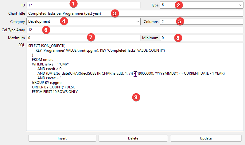
You can insert records programmatically into the OMDSH table using the Access Client SQL function. The Remain team created a simple maintenance function for the Dashboard file, which can be downloaded here:
File:Dash.jar - This requires a Java VM to be installed. Run with 'java -jar Dash.jar'
The analytics view displays charts based on the queries defined on the file OMDSH.
OMDSH contains the following fields:
- SHUUID: Universal Unique ID
- SHDESC: Description
- SHCATC: Category
- SHCHTT: Chart Type
- SHCOLN: Number of columns
- SHCOTA: Column type array
- SHMAXN: Maximum
- SHMINN: Minimum
- SHSQLD: SQL Definition
Chart Types
The field SHCHTT is a number(1,2,3,4,5,6) that represents the following chart types:
- 1: BarChart
- 2: PieChart
- 3: GroupedBarChart
- 4: StackedBarChart
- 5: TrendComboChart
- 6: TargetLineBarChart
Column Types
The field SHCOTA represents the column Series types. The following types can be used as elements of the column array:
- (1) Domain: the domain column of the chart series.
- (2) Value: The appropriate value of the domain.
- (3) Trend: indicates a line superimposed on a chart revealing the overall direction of the data.
Number of Columns
The field SHCOLN represents the number of columns retrieved from the query result. The number of columns must equal to the column types.
Category
The field SHCATC represents the category name given by the user.
Maximum
The field SHMAXN represents the maximum value defined by the user to indicate warnings in the charts.
Minimum
The field SHMINN represents the minimum value defined by the user to indicate warnings in the charts.
SQL Definition
The field SHSQLD represents the query to be used as data for the chart.
Description
The field SHDESC represents the description of the query.
Example
The following data is retrieved from the OMDSH file using the Dash.jar program.
The result of the query can be something like this:
 {"Programmer":"SHUKS","Completed Tasks":12}
 {"Programmer":"YADAN","Completed Tasks":4}
 {"Programmer":"MISHD","Completed Tasks":3}
 {"Programmer":"WIM","Completed Tasks":3}
In this case, we see four rows of two columns.
- The Unique ID
- The type. In this case 6
@TODO
